Tuesday 30 September 2008

Denver 2nd Road Jersey


This shirt has a very good design in my opinion. All the text and Numbers on the shirt are very clear and have excellent contrast. The Font of the numbers is clear, bold and easy on the eye. The font of the "Nuggets" is interesting, but still not too hard to read or to see. This shirt is 100% polyester which makes it a good shirt to wear when you are sweating, it is also a strong material. The light blue color on the sides of the shirt with the yellow stripe symbolises the main colors of the denver nuggets. This jersey has such features as a multi-layer twill Nuggets crest, embroidered NBA logo on the arm, and twill player name and number on front and back. This shirt is very comfortable, durable, classy and interesting. What more can you want from a basketball jersey. This is a great basketball jersey design.

Wednesday 24 September 2008

Cross Traxxion Basketball


http://www.nba.com/media/newball_brochure_060628.pdf

Spalding has designed this ball to be used in the NBA for the 06-07 season and later. This is the most advanced basketball on the market. The ball has a Patented 2-Panel Interlocking Cross Design which means there is more surface area for grip and the ball has a more consistent bounce. The 2-Panel cross design means there are fewer channels in the ball. The Hydrophilic Moisture Management System makes sure the grip of the ball stays consistent throughout the game. This system evaporates all the moisture on the ball. So when the playesrs hand sweat the performance of the ball wont be affected. This basketball is the future of basketball technology. These improvements will result in a much better overall ball performance.

Porsche 917 Concept by Adriano Stellino


http://www.carbodydesign.com/archive/2008/09/24-stile-italiano-giovani-2008-the-winners/

The 917 Concept is a very modern looking car with special features to make sure it has a good driving performance. Some of these features are the two wings instead of the average spoiler. This creates a feeling of tension and flexibility. Minimal overhang also helps the car performance wise. The 917 Concept was a winner at Le Mans 24 Hour race, which shows its great performance.
Alot of the design is based on saving weight, so alot of carbon fibre is used in the cars design. Everywhere where it is possible to use carbon fibre the designers used carbon fibre. For example the wheels are five spoke carbon which cover other five made in magnesium.
There are all kinds of new modern gadgets such as the rear view mirror is now a camera. Overall this car is very modern looking and can be described as good looking. The designers of this car did a excellent job performance and appearance wise.

Chapter 9

Categories of Type

There are thousands of different fonts to choose from, which are divided up into 6 main categories.
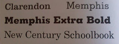
  • 6 main categories of fonts are: Oldstyle, Modern, Slab serif, Sans serif, Script, Decorative.
  • Oldstyle is based on hand lettering of scribes. This typeface has a diagonal stress and the serif on the lowercase letters are slanted.
  • Modern type started after advancements and culture changes. The stress on the letters is vertical and the serifs on the lowercase letters are now horizontal. This typeface has a striking appearance.
  • Slab Serif Started when advertising was introduced. They don't have thick thin transition like the earlier fonts. The stress is vertical and the serif is horizontal.
  • Sans Serif is a type of font that has no serifs at all. These fonts are monoweight meaningthere is no thick/thin transition. However, some of these fonts do have a thick/thin transition like sans serif optima.
  • Script is the type of font where it appears the letters have all been handwritten using some sort of pen or pencil.
  • Decorative fonts are just crazy fonts that are decorated. Reading a whole book in decorative font would probably make you throw up. They are just fun to mess around with and follow no rules what so ever.

Chapter 8

Type + Font

Type is the building block of any page with writing. People often use multiple fonts on the same page to give the page a classy look. Different fonts are used for the page for titles, sub-titles, and the basic writing.


  • Concordant is a relationship that occurs when you only use one type of font without a variety of size, style, color, etc.
  • The entire page looks the same and sometimes very dull.
  • Conflicting is a relationship that occurs when the types on the page are similar in size, style, color, etc. They are not the same neither are they wildly different.
  • Like using one font for the basic writing and one for the heading.
  • Contrasting is a relationship that occurs when you combine two or more typefaces together. They compliment each other and appeal to the eye. Therefore they are contrasting.
  • Size, weight, structure, form, direction, color are all ways to contrast fonts.

Tuesday 16 September 2008

Chapter 6

Review

In order to make a design you need four basic elements contrast, repetition, alignment and proximity. You also need guidelines which help you to create your design. The most important points in making a design are the following.
  • Don't be scared to try new things. Don't be afraid of leaving spaces etc.
  • Related items and objects should be in someway connected to each other. Like putting similar objects together on the page.
  • Align all the objects on the page with something else or the edge of the page creating a more sophisticated look.
  • Repeat certain fonts, styles, colors, etc. Giving the reader a sense of recognition. The more important the object the bigger, bolder, etc. it is.
  • Make sure your design is attractive to the eye. Make sure all the objects on the page stand out!

Final Version of my poster: (without Background)

Thursday 11 September 2008

Chapter 5

Contrast

The main principle of contrast is that "if two items are not exactly the same, then make them different, Really different". Contrast is probably the best way to make your page look more appealing to the reader.
  • Don't be a wimp!
  • Make your objects on the page different so they stand out. The more different the objects are the more they stand out.
  • To make things stand out make their font, color, texture, size, etc. very different.
  • if some of the objects on the page are hard to see or doesn't stand out. Make sure the object stands out from its background.
  • Make sure the headings and key features are easily spotted by the eye by using different methods of contrast.
  • Making boxes or using underline can make certain parts of your work stand out. The lines attract attention and therefore make the object stand out.
  • Using a bold font for headings and a smaller and thinner font for writing is a common method of contrast. Then the key features stand out compared to the writing, so you know the main idea.
  • Using a borderline to your page or for certain elements help to make your objects stand out.
  • Using pictures as backgrounds make the picture stand out and it makes sure the reader sees the picture.

Wednesday 10 September 2008

Chapter 4

Repetition

The main principle of repetition states that you"Repeat some aspect of the design throughout the entire piece. The element of repetition can be anything such as font, color, format, spacing,etc.
  • when you use the same font while writing your title you are using repetition. Repetition elements vary.
  • Repetition is like consistency, if you stay consistent throughout your work it will look more professional, cohesive and be easy to understand.
  • using bold font for the most important pieces of information is a very good use of repetition. The bold font attracts the eye and knows the key points of the item.
  • Headings are also written in bold to show their importance. It shows they are the key points or main ideas.
  • If you use things like headers or certain types of lines on your page make sure u use them throughout your piece of work.
  • If you use many different types of bullet points the observer will be confused. Use the same type of bullet point all the time for a good look.
  • For small details of a certain thing use the same font. it should be smaller than the font of the heading. Then the observer knows the difference between key points and small details.
  • Use the same type of indent to make sure your work is clear and simplified so he eye concentrates on the important things instead of the type of bullet points and etc.
  • Use repetition to show the reader the importance of each item on the page. The more important the item the bigger or bolder it should be.

Tuesday 9 September 2008

Chapter 3

Alignment

• The main principle of alignment is that “Nothing should be placed on the page arbitrarily. Every item should have a visual connection with something else on the page”.
• New amateur designers tend o place things anywhere on the page where there is space. This creates a messy look.
• When items are aligned with each other and separated physically, there are invisible lines created in your mind that put the information together.
• If everything is placed at random then you don’t see the connection between the objects.
• If you align all similar information then your mind will be able to connect them together and read it easily.
• If your text is centered it is easy to see the information groups, but a strong alignment would make the information even easier to read.
• If you use a combination of grouping important information and aligning them to show the information clearly you item will be easy to understand and follow.


Thursday 4 September 2008

Chapter 2

Proximity

There are different aspects to grouping things together. These are the aspects of proximity.
  • if you separate important facts by placing them in different places the information will be very hard to read and understand. But, if you group them close o each other the information is simplified and easier to read.
  • If information that is not related is grouped together, then it might not make sense at all and completely confuse the reader. It is vital that the objects that are grouped together are related.
  • Grouping information like a glossary in books and fliers makes finding information a lot easier. If this were all in one group then finding the information you need will take a long time.
  • Grouping things by using a certain font, text box or just placing them close to each other makes things a lot easier.

Chapter 1

The four aspects of Design

The different aspects of design help the designer create or make something, for example a poster or flier.
  • It is very important to name the principles in order to use hem effectively.
  • contrast is when you make something stand out on the page by making it a different color font, etc. This helps to see all the different objects on the page and make the page interesting.
  • alignment is the relationship between the different objects on the page. This makes the page look clean and sophisticated.
  • proximity is grouping similar things together. This way information is a lot easier to see and read. They become more like one unit instead of several.
  • repetition is using same element, picture, colors, etc. again on the same page. It creates a sense of organisation.

Wednesday 3 September 2008

Tuesday 2 September 2008

Creativity and Design preocess

What is creativity?

Creativity is a very well respected talent.However, there are different types of creativity which is not always fully understood or easy to follow. Creativity often gets confused with originality, but they an be very different. Originality is something that has never been done or made before. But, creativity is a collection of existing ideas formed in a new way or with a different concept. The best creators are usually very experimental and need to be able to solve problems that come up. Creators become better by making mistakes and learning from them and adapting their work.

Design Process

The design process is like the guidelines to creating a new design or creation. First you must plan what what you are creating and investigate it. Then you evaluate your plan add on to it if nececary and then create the final product. Most pieces of great design follow this process to avoid errors and faults. This process makes it easy to spot if you are missing something or need to add something in. It could also nspire you to better your creation. The design process is a very useful tool to use while creating designs.


A Comparison of Scientific Research method and Design Process models

Research methodDesign process
Preparation for researchLiterature reviewStudy historic and contemporary examples, media
Information gathering. Goal: to limit variables and identify problemCollection of preliminary field dataExperimentation with materials and visual ideas
Identification of problem and hypothesisInformation correlated; problem defined; educated guesses made; hypotheses stated; research design preparedDesign problem identified through visual analysis and recognition
Exposition of facts and interpretation Research plan is carried out; results are analyzed, plan is modified as necessary based on results; experiments are replicatedWork is created in a series, with each work suggesting problems to explore in subsequent work
Presentation of results and findings Publication of findingsExhibition of work or production of design